Commentary from Jason Smith (Broker)…
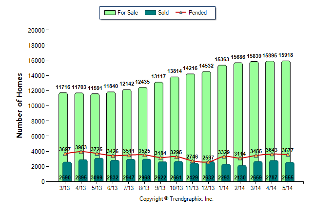
The graph above is an interesting one. The narrative in the market right now is that there is no inventory to choose from. The graph above shows a 35% increase in inventory over the past 14 months. This means that buyers have 35% more listings to choose from than they did one year ago. It must be said that the graph above is for all of Dade County and all price points (single family, condo and townhomes). Inventory levels change from neighborhood to neighborhoold.
Customized Graph Analysis for your home…
We would be happy to create a customized analysis for your home/condo to see the market for your potential listing in your neighborhood.

